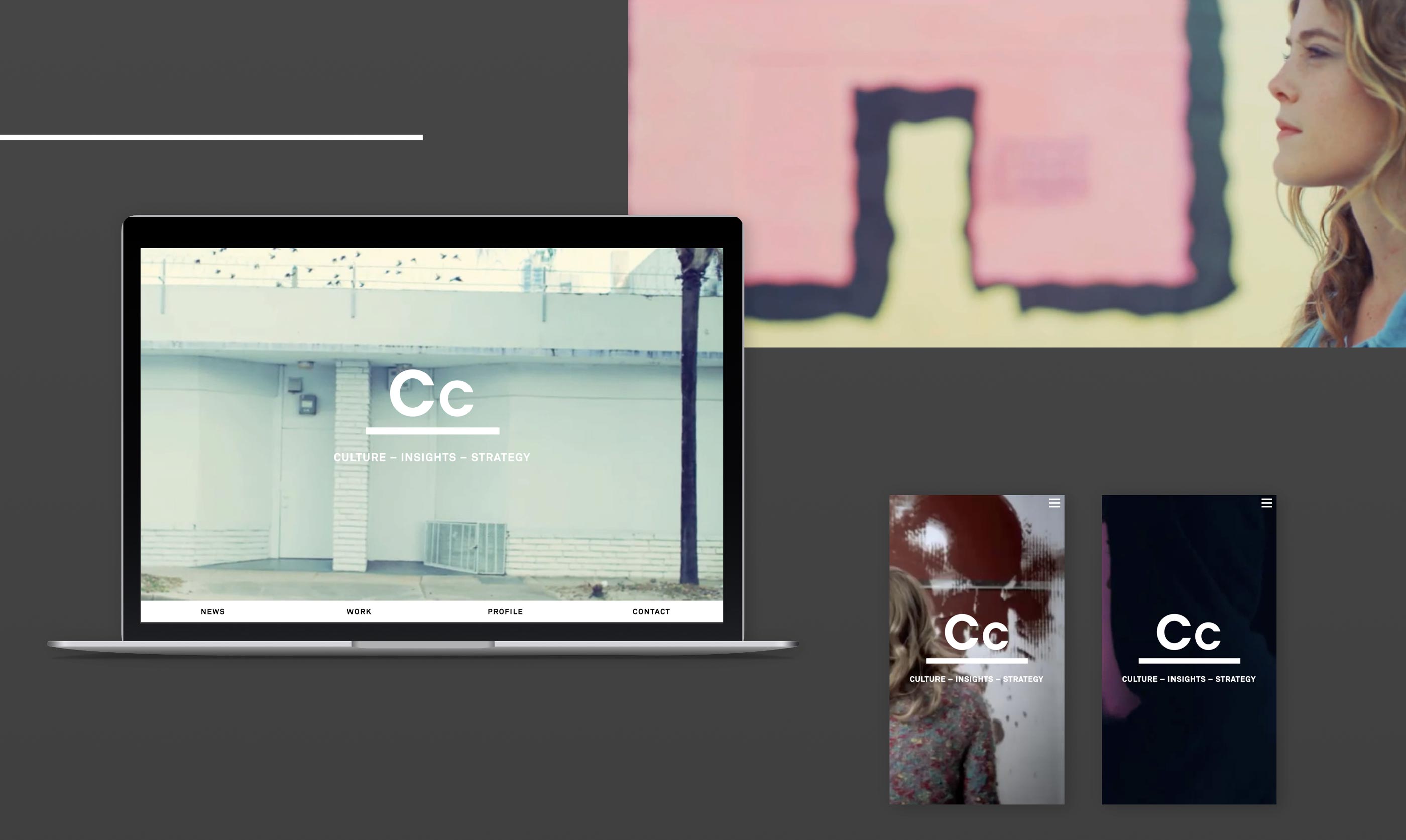
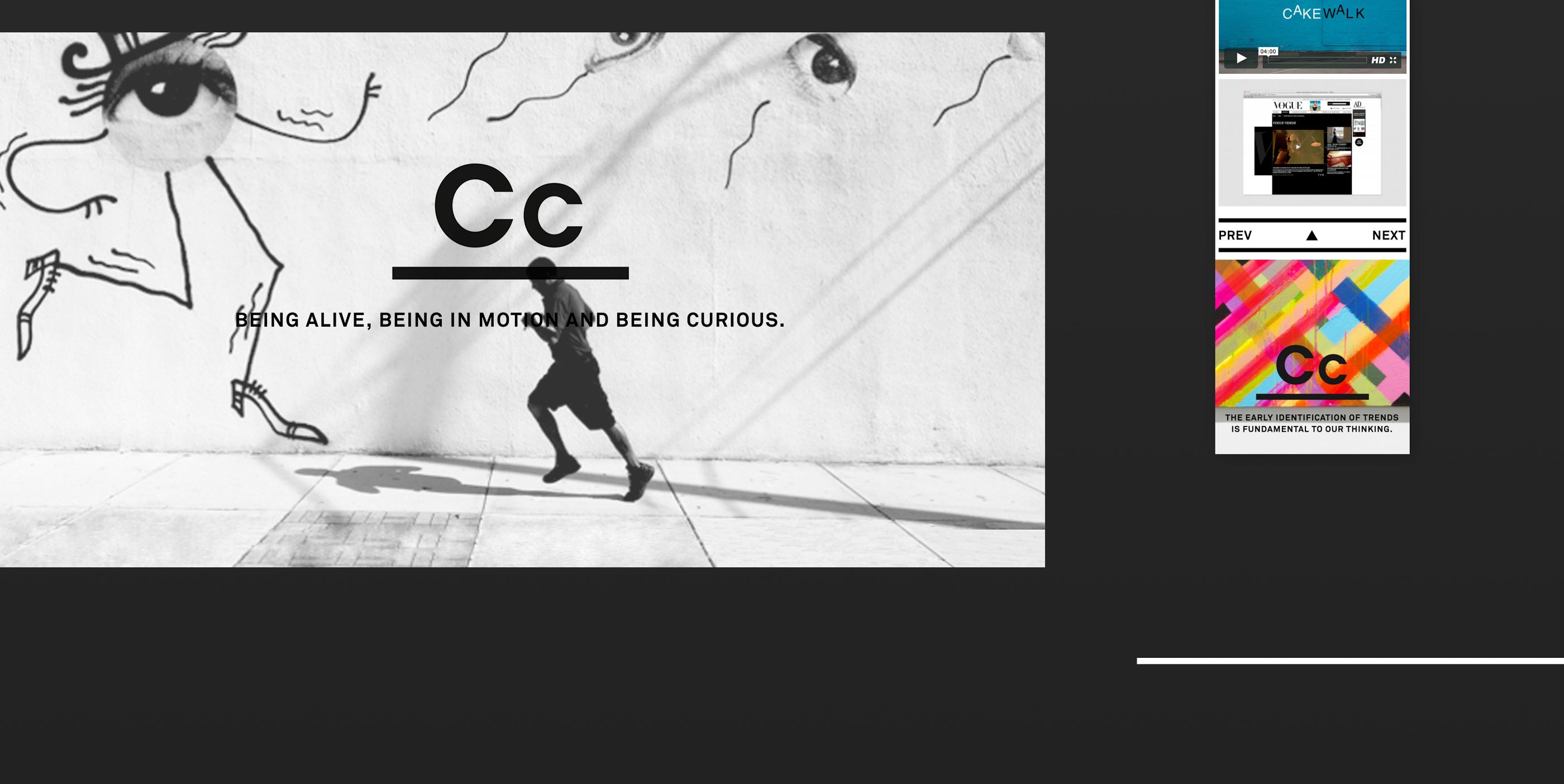
About the logo: The fact that Cc trusted me with their logo was honouring and challenging since the original sign had been drawn by the well-known designer Chris Rehberger. In order to create a lighter appearance of the logo, I chose to go with a geometrical font and reduced the thickness of the letters. I placed the letters above a thick line, to transport the idea of Cc as a creative platform for artists and other creative. This way the logo represented Cc’s brand purpose.
About the website: The stage and footer are always showing the logo combined with a statement. This is the heart of the website. Instead of working with a static company logo that always shows in the left corner as expected I placed it onto the stage. The content scrolls over it until the end where the logo and the statement shows again. This brings back the idea of Cc as a platform. The company’s statements at the end of the page are an inspirational finish.
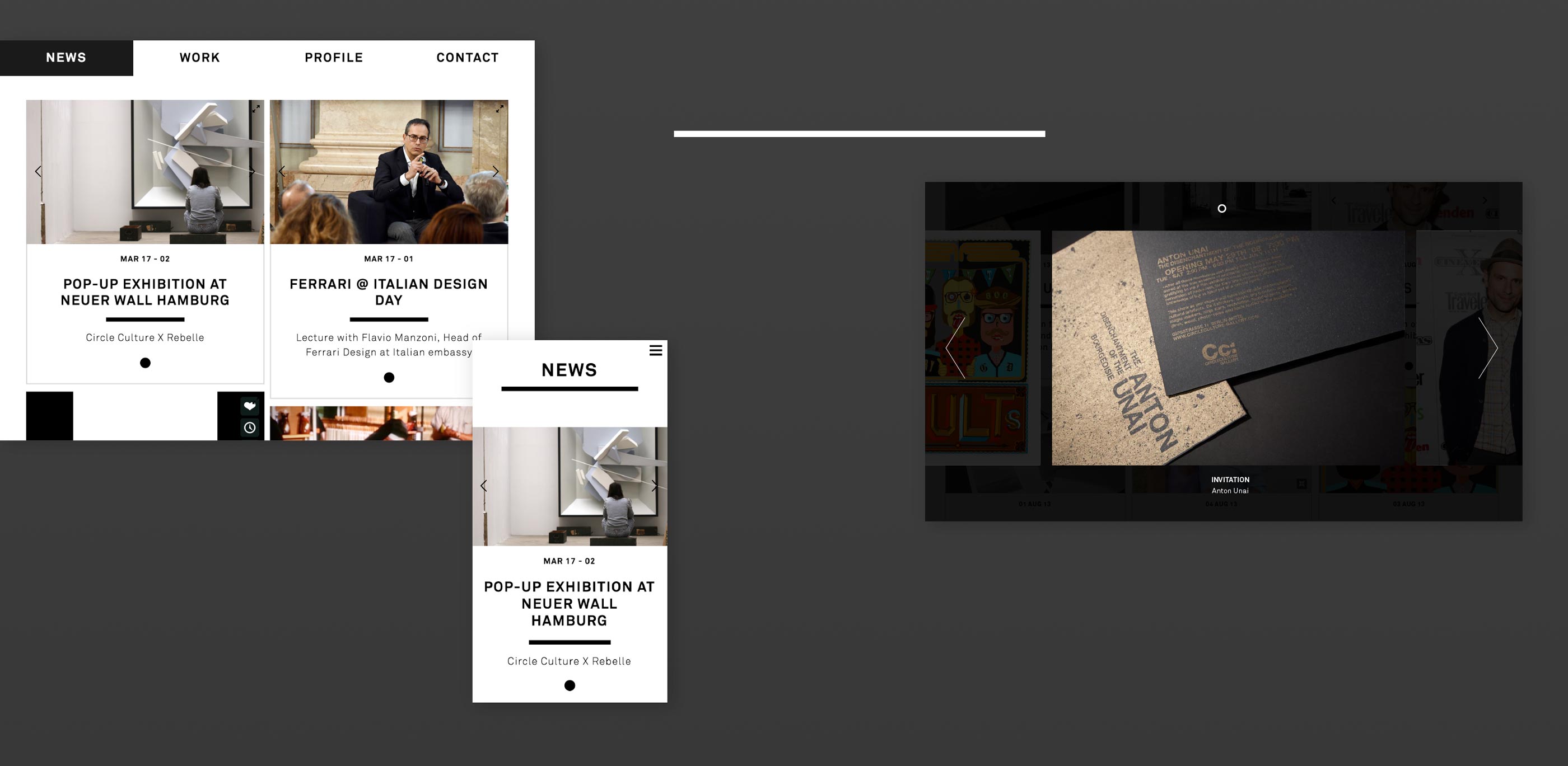
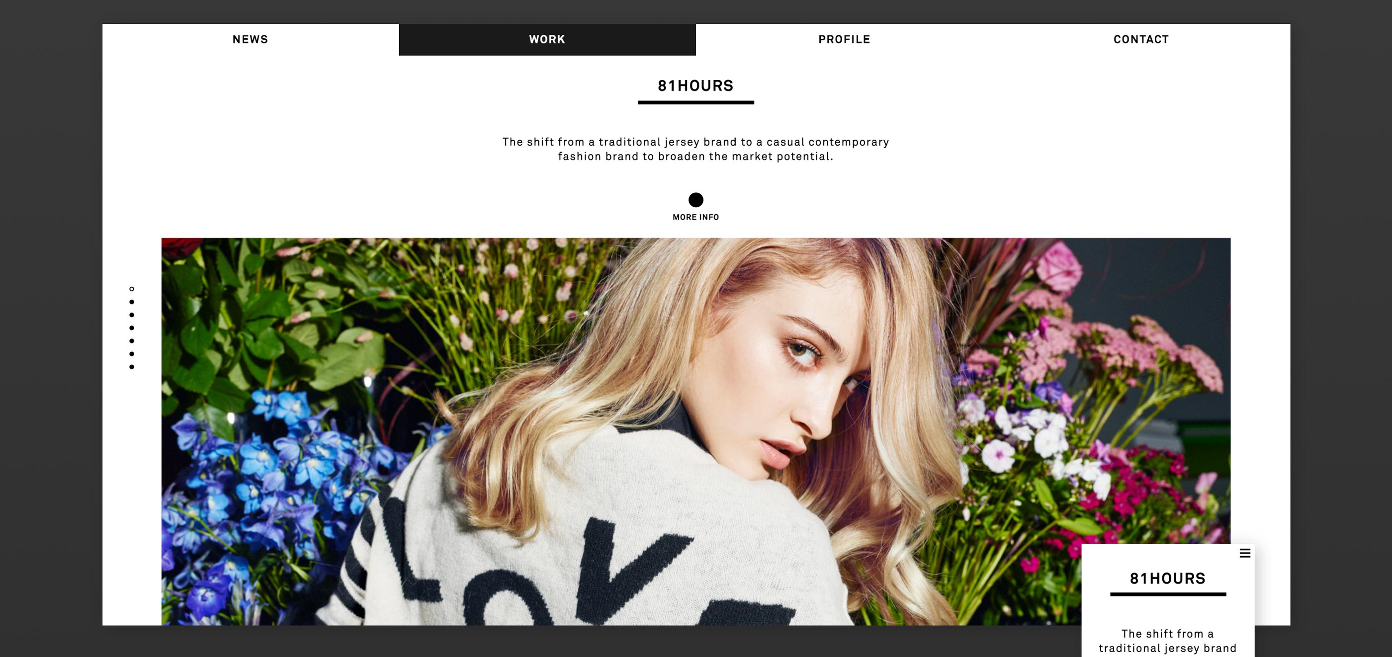
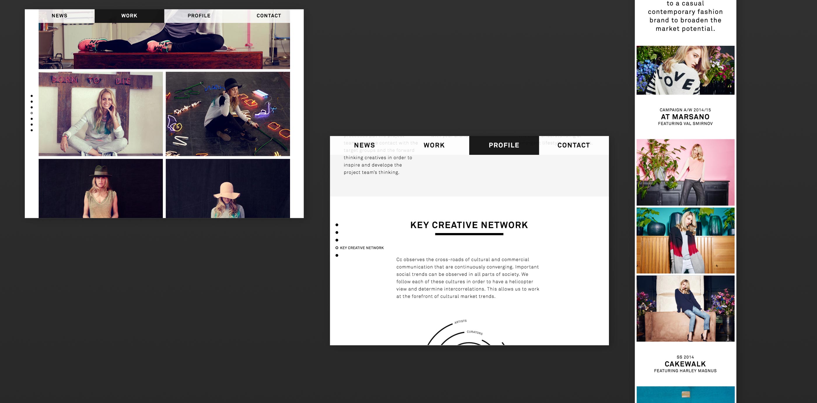
“Easy and intuitive” were the goals for the user experience. Therefore the structure is as clear as possible and all UI elements are easily accessible due to their substantial size.
