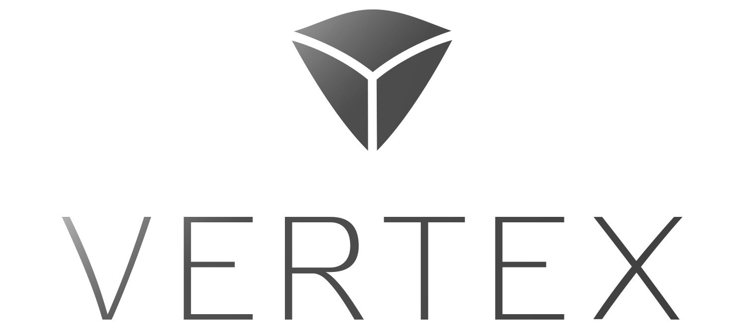
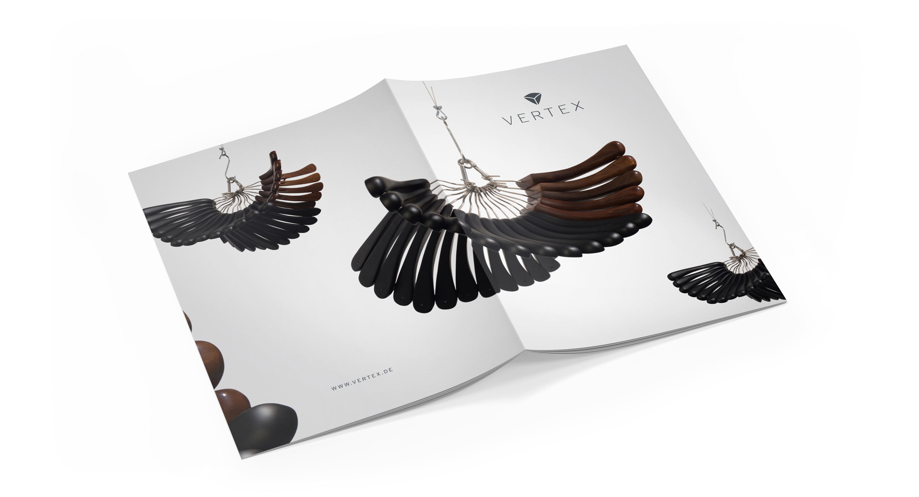
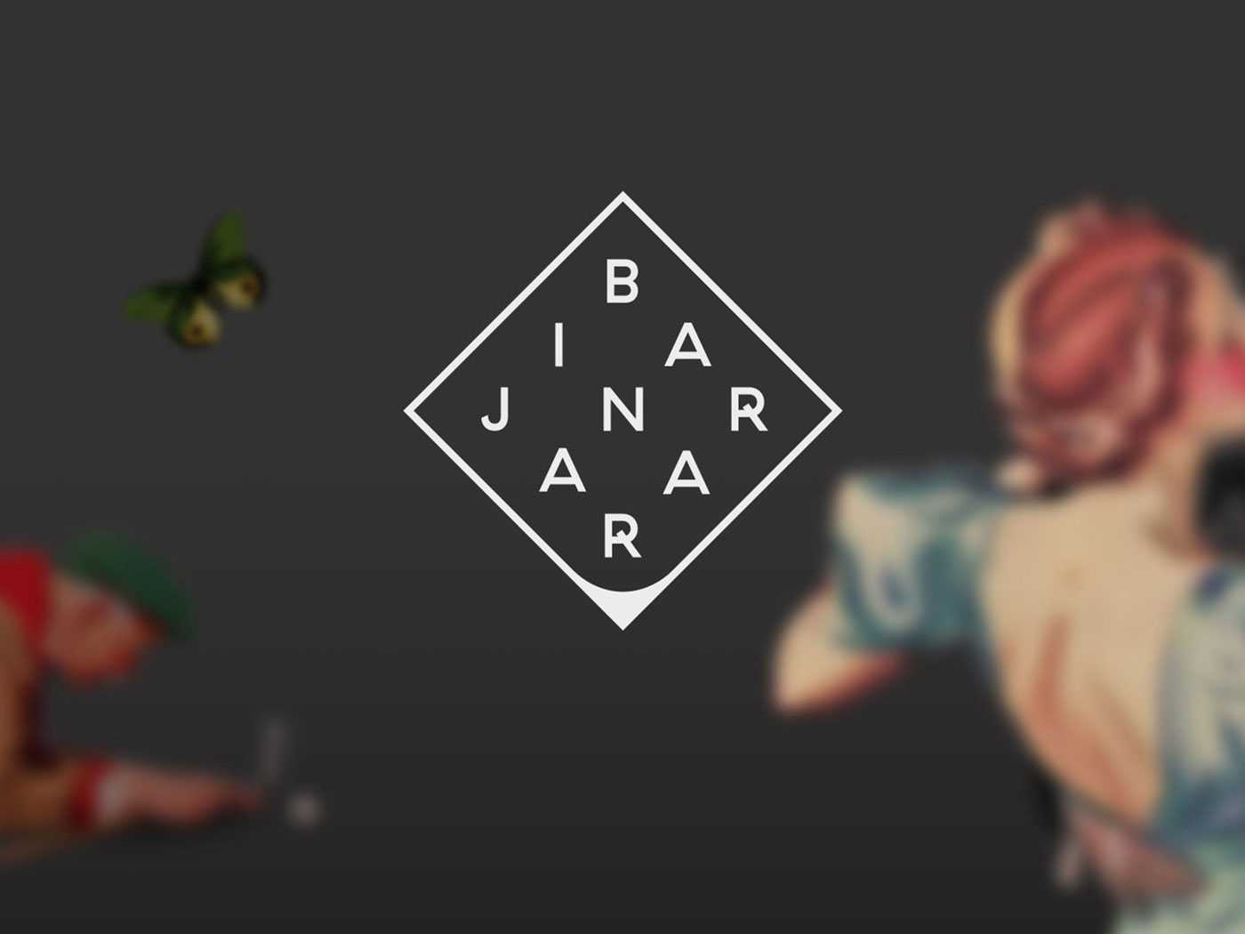
Out of two logo options I decided to use the version which works with a more abstract shape of a „shoulder“ for two reasons:
The less literal shape resembles a diamond, which reflects Vertex positioning as a premium brand. The second reason is about the view distance and the display quality. The abstract shoulder shape works better from a distance and when displayed on screens in small sizes.
As you can see below the vaulted curves of the sign are incorporated into the wordmark. This creates an agile feeling without loosing its premium character.


